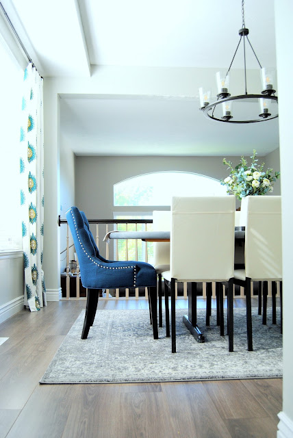
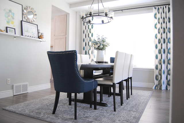
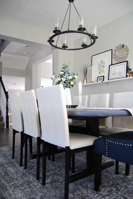
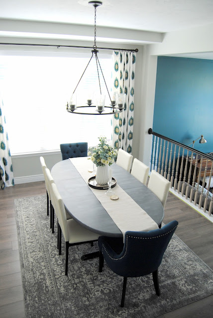
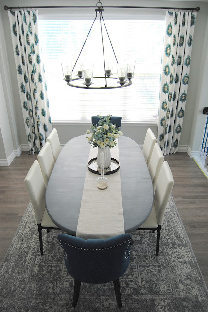
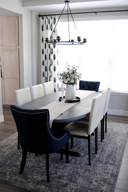
I'm thrilled to be sharing my new dining room with you today. We moved into our "new-to-us" home this past summer. One of the rooms I was most excited about was a formal dining room. I know these rooms are on the out with most new builds, but for me this was one of the top three things I needed in a home. I grew up with the best memories around dining tables. I remember holiday and Sunday dinners with extended family and friends. I knew in this stage of life my family is in I wanted this room to hopefully create the same special memories I had for my own children.
So you can imagine how my creative juices just came flowing to me for this room the minute we got the keys. This was the first room I wanted to design, and what a joy it was to create.
You can view the "before" below. It was such a dark room. I found out from neighbors that not one owner in the last 20 years ever used this room as a formal dining room, always just a flex space. I knew that I needed to fix this asap. Keep scrolling to see this same view, all refreshed...
It really always amazes me what a can a paint can do for a space. I used my signiature paint color,
in a satin finish. This is with out a doubt my favorite paint color. It is a light gray paint that can read true gray, blue gray and then green gray in different times of the day. Because of that I never seem to tire of it. Aloof, the perfect name for it.
The next item that really brought life into this dining space was switching out the standard "boob" flush mount ceiling light for this gorgeous
This had been on back order right when we moved in and waiting a few weeks for this to arrive was well worth it. You can style it with or with out these glass votives, and they also come in frost finish. It truly is stunning, and having the six lights versus the dingy two creates such a gorgeous setting during dinners.
in Sandy, UT. They have been my go-to flooring company for my local design clients the past few years. They are so easy to work with and always are able to beat the best local pricing when we've checked out other companies. Their service has been so great and I was very impressed with the job their installers did. We also hired them to install new baseboards, I am so pleased with the quality of work. We went with 5 1/4 height boards, and they are such a gorgeous after thought.
If you are local to Utah, I 100% recommend them. Ask for Barrett, he is so great to work with!
When I had my inital in home carpet consult Barrett had brought a few different samples ranging from $1.50 to $8 a sq ft. I had fallen in love with an expensive engineered hardwood that is identical to the flooring we had installed. I told him what I wanted to spend and he suggested this flooring, which is on sale for $1.50 a sq ft, and side by side it was hard to tell the difference. Then he did the "key test" where he literally took his car key and scratched the heck out of the sample and it didn't show any damage. I knew this was the one for us. It is a cooler wood look with a gray undertone, but next to my cooler palette it reads a lot more warm. Just the look and durability I was after.
Here is another fun "before and after" of the space, showcasing the beautiful stair transformation. I can't get enough of this new view. I have so many "stair tread with white risers" inspiration pictures saved on Pinterest, and I'm so pleased to be able to see this view every day now.
The next item of business was refinishing my dining table top. This baby has been in storage for the last 5 years, I couldn't part with it seeing as it was made in denmark and is made out of solid teak wood. I knew the look I wanted and though my efforts didn't create the outcome I wanted, I am pleased with the look. I took to youtube and watch several dry brush tutorials with chalk paint. I used
paint from the Home Depot in the 'Relic' dark gray shade and dry brushed 'Yesteryear' in a light gray over top of it. I sealed it with the same brands varnish. And no, I will not be doing a tutorial, ha. I'm by no means an expert, and found the professional videos on google super helpful.
Now to my favorite part of the design process, and that is the design details.
The initial inspiration for the space were these curtain panels that I wanted to reuse from my old home. Moving here we were able to gain an extra foot in our ceiling height, which is great, but made it so none of my curtains from the previous home would be able to work. Then I realized there was a dip in the ceiling where a vent is so I quickly measured and was estatic to find out it was the perfect height for my favorite pair of panels. So I planned my mood board and room design around these gems.
The way they frame the windows and bright some personalty to the space is just what the space needed to feel complete.
I have always loved a dining room with mix and match dining and captains chairs. I wasn't quite certain what color I wanted but knew I wanted this shape of chair. My heart skipped a beat when I found these
They were the perfect shade of deep teal that would match the curtains perfectly. I loved the tufts and nail head detail and knew they were the ones.
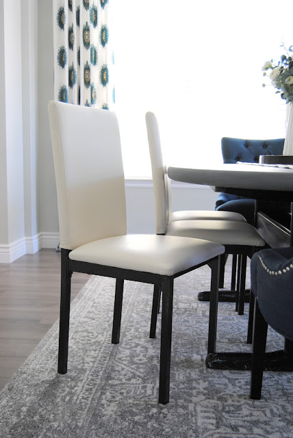
When looking for the dining chairs I knew, with out a doubt, I wanted to be able to fit three smaller chairs on each side of the table to seat more, and knew I for sure wanted a material that would clean easy, and was durable. I also wanted something bright and airy to keep the space light. I was estatic when I happened upon these modern feeling
I love the shape and appreciate the solid steal leg frame. Even my husband mentioned the solid feel they have. They are petite, yet so sturdy and SUCH an amazing price. The perfect look and feel to finish off the dining set.
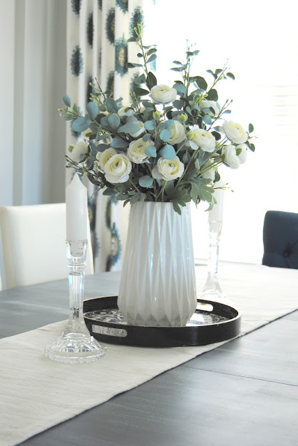
Of course I love real, fresh flowers, but another love of mine is creating faux floral arrangements for myself and my clients. My go to place to buy the stems are
and every other week their stems go 50% off. I was able to create this pretty arrangement with the white ranculas and some velvety greenery with the vase for under $50.
Also, heres a fun fact...
We got these beautiful crystal candle sticks as a wedding gift over 12 years ago. They have sat in storage because I was afraid to get them out and have them break. I love seeing them every day displayed on the table. I have come to realize I kind of have a thing for crystal, and I just adore the detail they bring to the space.
So there you have it, my process as I designed this dining room, and all of the details. For a few more design and decor details just scroll below for details and links. If you have any other specific questions please leave a comment or you can email me directly at
kristen@studio7interiordesign.com
Thank you for taking the time to read my post. I appreciate it so much!
*Affiliate Links Used in this Post.
*Affiliate Links Used in this Post.

