Interior Design in the Greater Salt Lake Valley

The Importance of Proper Lighting...

proper lighting, ambient lighting, task lighting, accent lighting, lighting, lamp, chandelier, sherwin williams, zgallerie, sunburst mirror, evening, sitting room living room, family room, cathedral ceiling, vaulted ceiling, ikat, pillows, upright piano, piano, ballard designs, lowes, overstock, tuesday morning, down to earth, gardner village,
 It's been a fun & interesting thing for me to talk some of my clients in to putting a lamp into their space.  There are quite a few people out there that are missing out on such a wonderful home atmosphere because they haven't realized what proper lighting in a room can do.
So I wanted to share and explain why it is so important for any room in your house to have some great lighting options!
proper lighting, ambient lighting, task lighting, accent lighting, lighting, lamp, chandelier, sherwin williams, zgallerie, sunburst mirror, evening, sitting room living room, family room, cathedral ceiling, vaulted ceiling, ikat, pillows, upright piano, piano, ballard designs, lowes, overstock, tuesday morning, down to earth, gardner village,
 There are 3 different "layers" of lighting that you need in a home.
The first being Ambient Lighting.
That mainly consists of any hard, overhead, ceiling mounted light fixtures.  A lot of homes have the cheap-o standard flush mount fixtures that most times are too small scale for the space, and that is all that people have for lighting a room.  Putting a better scaled fixture that allows more light in the room will add so much!  I would say the most important rooms in the home that Ambient lighting is crucial is the kitchen and the bathrooms.  
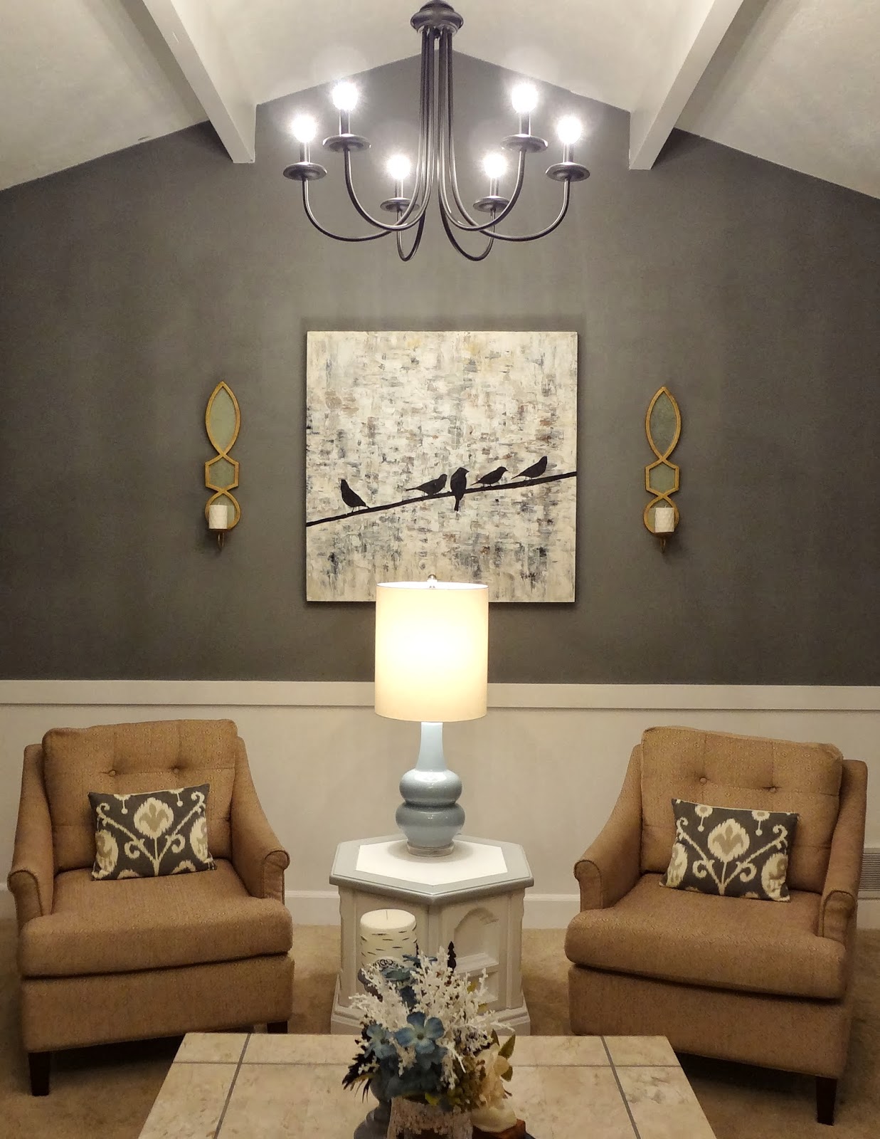
My two favorite lighting resources are surprisingly Home Depot and Lowe's!  These fun chandy's were purchases for only $55 a piece at Lowe's, we just added round soft white bulbs rather than the flame shaped ones to add a fun contemporary element.  They are such a wow factor in the space and are one of the first things people notice!
proper lighting, ambient lighting, task lighting, accent lighting, lighting, lamp, chandelier, sherwin williams, zgallerie, sunburst mirror, evening, sitting room living room, family room, cathedral ceiling, vaulted ceiling, ikat, pillows, upright piano, piano, ballard designs, lowes, overstock, tuesday morning, down to earth, gardner village,
 The Second Layer is Task Lighting.
This is talking about lamps.  In my opinion, proper task lighting is THE most important element when designing a space.  It is especially crucial for sitting area's, or bedrooms for, yep, you guessed it, completing a task, like reading.  The best part about task lighting is the fact that there are so many fun artistic lamps available to be a beautiful statement piece in the daylight, when not in use, and acts as functional art in the evening.  
My favorite go-to place for Lamps is Target, if you are on a budget. Overstock.com has a plethora of amazing finds, ranging from budget friendly to splurge central. 
proper lighting, ambient lighting, task lighting, accent lighting, lighting, lamp, chandelier, sherwin williams, zgallerie, sunburst mirror, evening, sitting room living room, family room, cathedral ceiling, vaulted ceiling, ikat, pillows, upright piano, piano, ballard designs, lowes, overstock, tuesday morning, down to earth, gardner village,
 The third layer is Accent Lighting.
This one  is candles, sconces or mood lighting.  I wouldn't call this a crucial lighting element, but in the right rooms are so nice to have.  Love putting hardwired sconces on a dimmer switch in hallways or foyers.  

All in all, proper lighting in your home WILL make so much of a difference and I promise you, will up your spirits, clear your head, and make your home feel like a happier place.  If not, see me and I will pick out the right lighting for ya! :)
proper lighting, ambient lighting, task lighting, accent lighting, lighting, lamp, chandelier, sherwin williams, zgallerie, sunburst mirror, evening, sitting room living room, family room, cathedral ceiling, vaulted ceiling, ikat, pillows, upright piano, piano, ballard designs, lowes, overstock, tuesday morning, down to earth, gardner village,


How to Stage a Bookcase

Bookcases usually end up in a few rooms of the house, and most times just end up collecting stacks of books and other things that don't really belong there and, had you taken a little bit of time, could be the focal point of the room, or allow you to tell the story of why you call your house a home. 

I love this transitional bookcase in this space, you can find it here.

1)  First, I usually always end up painting a pretty accent color to the back of book cases.  Using a fun color to pop, a nice patterned wallpaper or stencil, or just a nice contrasting color works great and will give the bookcase depth and interest. 
In this case I chose a subtle gray color that was lighter than the dark charcoal walls.  It gives a tiny bit of dimension and is a perfect back drop for the beautiful decorative pieces.
2)  Pick a color scheme you want displayed.  Usually you are good with going with 3 or 4 different subtle colors so the space doesn't look too busy.  In this case I picked metallics, b&w, and for the 'pop' a soft turquoise color.
3)  Next collect all the decorative items in your house you are not using.  More times than not you have a handful of great pieces that will just need a new piece to make it pop, like a candle stick could just use a more updated candle topper, you could spray paint an old frame, or a vase could just use some new silk flowers from the hobby store.  In this clients case we only used a handful of things she already had, so I had a budget and I went to a few of my favorite discount home stores.  I got most of these items at Walmart, TJmaxx, Homegoods, Target and DI.(our local goodwill)  No need to spend a lot on these items, just that they are visually interesting and will stand out and make an impact.
Think height, shape, what colors will pop against the bookcase.  I don't decide how to place things until after I have a bunch of items to use.  Sometime you will end up returning things not used, but I say its always better to be safe and have more to work with.  
4)  When it comes to the books I display I usually go around the house and see all of the books there are to work with.  I keep the ones that have a pretty spine, and a good colored spine.  I always take the book sleeves off and I like to stack them as seen here, and put them upright on one side of the shelf.  I usually always flip at least one or two around to give visual interest.  And I try to not have the same colored spine right on top of the same color.  Mix them up to give interest.  Also, I love laying them on top of each other on one shelf then on another shelf stacking them side by side.  
And for those who ask... "why don't you display MORE books here?"  Here is your answer.  Most of my clients do have additional spaces to house their books they read often, (office or library) or don't really want to display all of their books in their living spaces.  To be honest, more times than not I buy the displayed books at 2nd hand shops and just search for the right scale, colors and bindings.  

5)  When you have all of the items lay them out in groups.  So all of the frames together, all of the vases together, etc, etc... It is best to see in plain site what items you have to work with.  When displaying the items I usually take some time.  I place items in two's then the next shelf three's and back to two's, and I make sure whatever item is above and below on the shelf isn't right above or below the other. (ie... don't have a vertical row of picture frames or books) try staggering items, shapes and colors from one side to the other...  And the shelf could have 6 items on it, the key is to group them to give the look of say two picture frames as one item.  
7)  DIY saves money, and gets you the desired result!  For example, don't forget that you can make your own flower arrangements to save money, and most importantly, fit the space.  I made the one below here with a low potted vase, and the right size flowers I wanted.  This came to only $10 at Walmart!
8)  Don't fret if you have to take a gazillion steps back and make sure the items are balanced on the book cases, and my secret to knowing if it really looks good is taking pictures.  I take pictures with almost every part of staging a room.  Bookcases are a must.  Lots and lots of pictures from different angles!  That way it will save you from thinking you are done, then seeing it in a different angle and having to move something.
Try mixing up the colors and shapes to give the bookcase balance.  For example, if you have a gold frame on the top right, try placing another gold item not of the same shape but the same color two shelves below on the left side.  Then two more shelves below have another gold item on the bottom right.  The same goes for the items.  Try to have the items not clumped together and have them create a natural flow for your eye to look...

All in all staging bookcases is so much fun and makes the biggest impact in a room by far.  I truly believe it's in the tiniest of details that a room goes from ordinary to extraordinary. :)

See full room reveal here...

Bookcase:
Chair:
Mirror: 
Chandelier: 

Client Reveal: Colorful Nursery

Ikea, wall gallery, blue, pink, turquoise, green, purple, curtains, hot pink curtains, gray walls, seattle, poufs above crib, white furniture, nursery, tjmaxx, throw pillows, studio 7 interior design
 Have I ever told y'all that I love my job???!  Well, I do!  
Designing this nursery was so much fun!  
My client had the crib, rocking chair and dresser/changing table and called me to finish the space.  She didn't want to spend more than $300 to complete it.  Challenge accepted and fulfilled!
This room went from an off-white boring space to having so much life and personality!
Ikea, wall gallery, blue, pink, turquoise, green, purple, curtains, hot pink curtains, gray walls, seattle, poufs above crib, white furniture, nursery, tjmaxx, throw pillows, studio 7 interior design
This inspiration for this room came from a rug I have been eyeing from Anthropologie.
I knew as soon as I saw this room that the walls needed to be painted a soft gray and that the rest would be full of splashes of color!  The floral pillow in the crib set the stage and I created this mix match bedding from Target and Babies R Us.  It is so much fun seeing this all in my head and watching it come to life just as I saw it.

Ikea, wall gallery, blue, pink, turquoise, green, purple, curtains, hot pink curtains, gray walls, seattle, poufs above crib, white furniture, nursery, tjmaxx, throw pillows, studio 7 interior design
This rocking chair is being used for my clients 4th child and she didn't know if it could be pulled into the room.  Getting the blue chevron crib sheet  does just the trick and the rocking chair fits the space perfectly!
Ikea, wall gallery, blue, pink, turquoise, green, purple, curtains, hot pink curtains, gray walls, seattle, poufs above crib, white furniture, nursery, tjmaxx, throw pillows, studio 7 interior design
 I LOVE how this bedding turned out! Though it is just a mish mosh of bright colors the throw pillow pulls it all together.  
Ikea, wall gallery, blue, pink, turquoise, green, purple, curtains, hot pink curtains, gray walls, seattle, poufs above crib, white furniture, nursery, tjmaxx, throw pillows, studio 7 interior design, hemnes dresser
 These curtains were only 84" long so we ordered the matching crib sheet, sliced it in half and sewed it to the bottom to be able to hang the curtains higher.  Hanging curtains the length of the ceiling gives the illusion that the ceilings are taller.  Love how the turned out!
Ikea, wall gallery, blue, pink, turquoise, green, purple, curtains, hot pink curtains, gray walls, seattle, poufs above crib, white furniture, nursery, tjmaxx, throw pillows, studio 7 interior design
Oh, I love IKEA!
Everything aside from the lamp was purchased there.  They have such great, inexpensive solutions to make a room feel like home.
Ikea, wall gallery, blue, pink, turquoise, green, purple, curtains, hot pink curtains, gray walls, seattle, poufs above crib, white furniture, nursery, tjmaxx, throw pillows, studio 7 interior design
 Creating this wall gallery was too much fun!  Love how the colors are showcased against the gray and white back drop.  
My client loves the space as does her new born.
Project Design on a Dime Nursery ... Complete!

DESIGNED BY ECLAIR DESIGNS