I am so excited about this post! I knew the moment we moved into our home last fall that I needed to find a cute dog crate to act as an end table to give our Boston Terrier a place to relax in the family room. I spent quite some time looking for the perfect one, and even priced out how much it would be to have a guy make one for me, then I found this beauty! I LOVED the detail on the door, it just wasn't the right colors... But I knew that could be changed.
Bright & Bold Designs Giveaway Winners...
GIVEAWAY CLOSED!
I used www.random.org to pick the winners.
Congratulations to @alihot & @angielundquist
You both are are giveaway winners!
Please contact Shaylyn of Bright & Bold Designs to claim your prize.
Thank you to all who entered!
Looking forward to hosting another giveaway soon!
Giveaway: Bright & Bold Designs
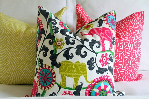
I am thrilled to be hosting my first official giveaway!!! This particular one really excites me! As you can tell, the giveaway is for these darling pillow covers! But here is the exciting part... its for not just one 18x18 pillow cover, but for TWO! You have the chance to win one for you & a friend!
Cute Shalyn over at Bright & Bold Designs contacted me about hosting and I couldn't wait. Most people who know me know how much I live for cute pillows, and especially how much I drool over bold graphics and bright colors. Bright & Bold Designs delivers! And, here's the icing on the cake... they are budget friendly!
Shalyn was also sweet enough to give my reader's a 10% off code good through Friday. Be sure to check out her shop and order one or two, you know you want to!
10% off code: studio7
Here's How to Enter:
1) Visit Bright & Bold Designs Shop and take a looksie at the pillows. Then leave a comment on this post with which cover you would love to win.
2) Visit Studio 7's Instagram page, follow both mine & Bright & Bold Designs accounts, then find the giveaway post and tag 5 friends who you would want to win a pillow cover. Each tag will give you one entry. But only those who follow will be eligible to win.
So you can earn up to 6 entries!
The Giveaway will close on Friday, March 28th and will be announced by 9pm MST.
Best of luck to you!
Labels:
Giveaway,
Living Room,
Pillows,
Staging
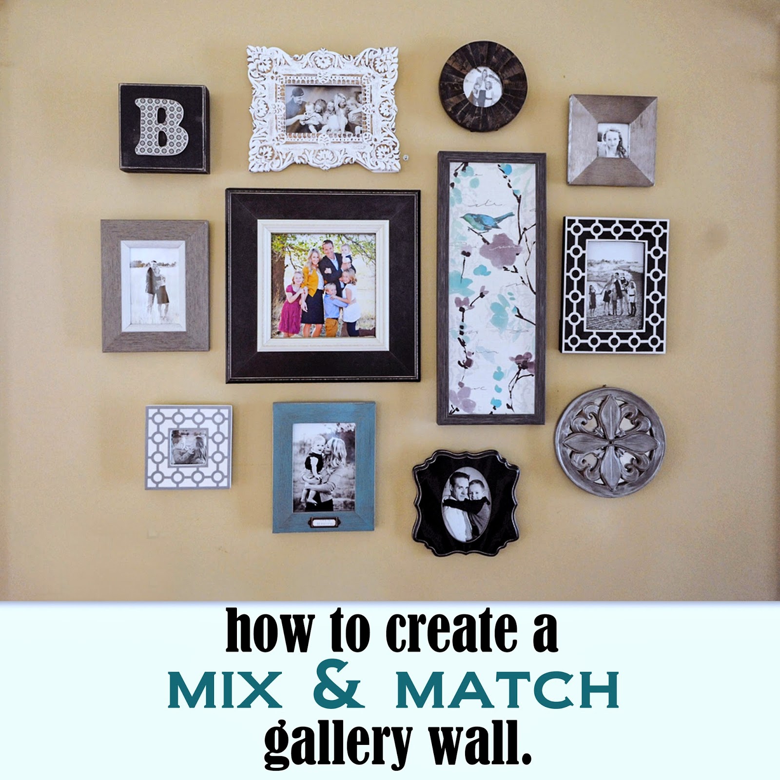
Client Reveal: Mix & Match Gallery Wall
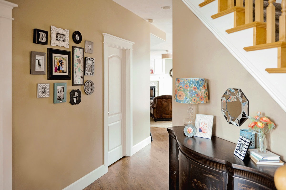
I had such a fun time working on this project! My cute client/friend is a very talented photographer and she writes for the popular blog 'Click it up a Notch.' She asked for my help in styling her entry way for her blog post, 7 tips for choosing which images to print for your home. It was a great article, so be sure to check it out!
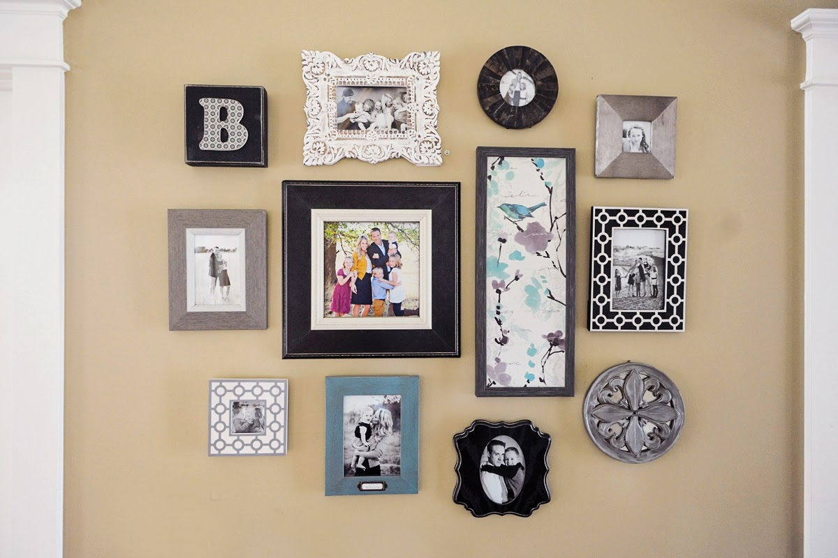
The only thing she knew she had to have was a gallery wall to display her photography opposite this black credenza in her foyer. I made sure to pick a few black frames to balance out the heaviness of this furniture piece. Adding in these current colors and graphics gives this other wise traditional piece the updated, trendy look my client was after. I love how it turned out!
Creating a mix & match gallery wall like this one is a lot of fun! I always have one or two larger frames to anchor the center and to have the eye immediately go to. Then I will create a circle of frames around the center piece. It doesn't have to be perfectly symmetrical, just let your self have some fun with it! I buy a bunch of frames and bring them to the space and play around for a bit. More times than not I will end up taking a few frames back, but to be safe get a few more than you think you will need. Be sure to try and balance out colors and shapes also. A trick I use to make sure it's balanced is taking pictures to see how it looks on camera. That always does the trick in really knowing how it looks. The good thing about a project like this is there is no wrong answer!
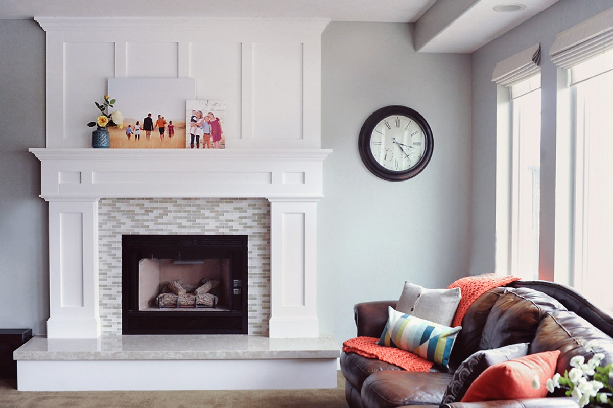
We decided on the color scheme from the family room that is just around the corner from the foyer. Here is a sneak peak of this room we are decorating. Just waiting on a few pieces to arrive to finish it! And check out this mantel! My friend's husband did all the handy work on this beauty! Absolute PERFECTION!!!
Photo Cred: Jen Bacher of www.jenniferbacher.com
Labels:
Designed,
Family Room,
Foyer,
Mantel,
Staging
Room Reveal: Little Girl's Bedroom
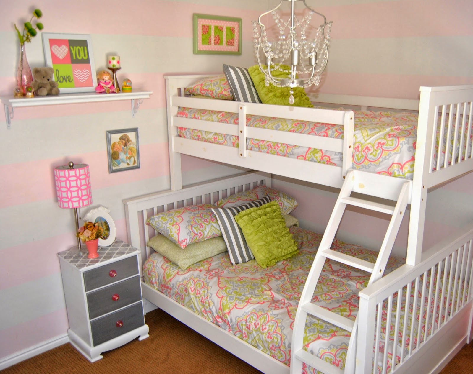
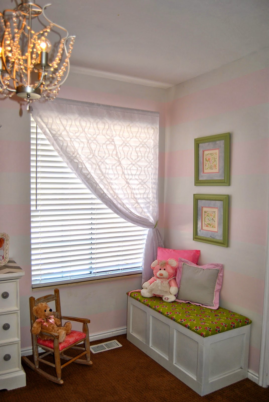
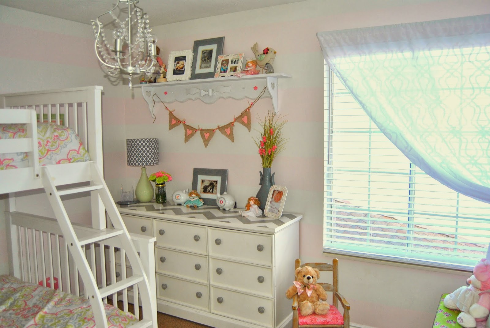
These two little sisters are my all time favorite clients, reason being... they are my own spunky little girls and designing this room was a dream! The number one reason why I loved doing this room so much more than their individual nurseries is because I know them now... I decorated their other rooms while they were still in my womb, so I could only use my imagination and guess from what I could tell their personalities would be. :) The last 4 and a half years of motherhood has been pure heaven, so entirely blissful, and this feeling is what I wanted to create in their room. I think I nailed it on the head, and I am so happy with how it turned out, but I am even more thrilled with how much I see them loving and admiring their room.
The starting point of the room was picking out this bed and bedding. I knew I wanted to get a white twin over full wooden bunk bed for them to share and I was so excited when I found the comforters at TJmaxx on super clearance and added a few pillows.
II purchased this bunk bed from a local wholesale warehouse, but found this similar version on amazon for an even better price!
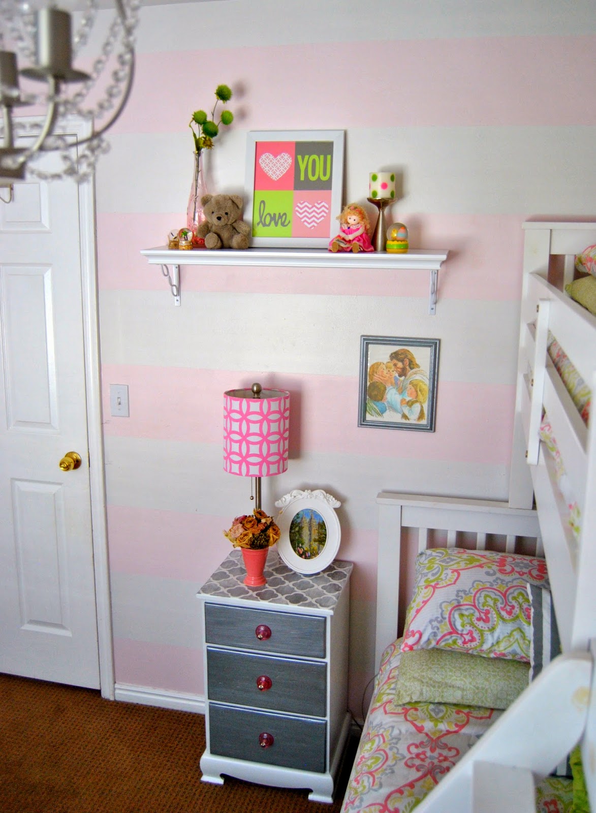
After I decided on the color scheme, I decided on the wall treatment. I wanted something super airy and light, and Olivia insisted on pink walls. So I went with 75% strength of Kwal's 'pink-a-boo' and made stripes with Kwal's 'washbasin'... Its VERY subtle, but I new I didn't want a saturated pink, so to me, this turned out perfectly.
Stay tuned for a tutorial I have in the works to create the perfect stripe. :)
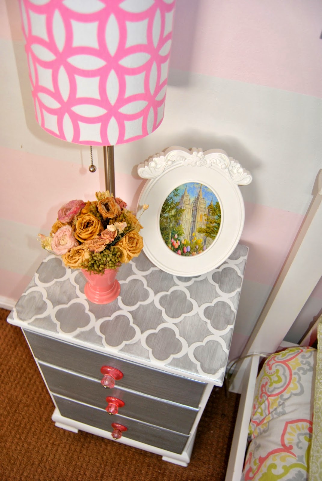
I found this little guy a few years back for Charly's nursery at a consignment shop for $30. I painted it Rustoleum white and added a cute stencil on the top in a silvery gray. Similar quatrefoil stencil's can be purchased on etsy.
I chose to put a shelf next to the top bunk per my 4 year olds request. She was a tad jealous her little sister had a place to put her night time water cup and thought she needed a spot for hers too. She was so excited and proud helping me hang her shelf. Home girl even knew what a level was. (proud momma moment right there!) These little items are a few of our keepsakes, this little teddy bear was actually the bear I took home from the hospital when I was a new born. I am so sentimental and I love seeing my childhood buddy displayed after all of these years.
My sweet Grandfather made the girls this toybox for Christmas one year. I am so happy to have been able to create such a sweet "window seat" area in their room. We love reading books here.
This delicious dresser was a lucky ksl classifieds find!!! It not only has 9 generous sized drawers, but the lady new what she was doing when she refinished this, and of course I adore the chevron top!
 |
I love how all of the graphic prints came together in this room! There is a lot going on in here, but the prints work together because they are a similar color.

Again, here are more keepsakes displayed to remember. A few of these items I have had for over 20 years...
I sure love how this room came together and hope you enjoyed seeing a little bit into my home. Thanks for stopping by!
-Kristen
Labels:
Bedroom,
Children's Space,
Designed,
DIY,
lighting,
Nursery,
Refinished Furniture,
Staging
The Importance of Proper Lighting...
It's been a fun & interesting thing for me to talk some of my clients in to putting a lamp into their space. There are quite a few people out there that are missing out on such a wonderful home atmosphere because they haven't realized what proper lighting in a room can do.
So I wanted to share and explain why it is so important for any room in your house to have some great lighting options!
There are 3 different "layers" of lighting that you need in a home.
The first being Ambient Lighting.
That mainly consists of any hard, overhead, ceiling mounted light fixtures. A lot of homes have the cheap-o standard flush mount fixtures that most times are too small scale for the space, and that is all that people have for lighting a room. Putting a better scaled fixture that allows more light in the room will add so much! I would say the most important rooms in the home that Ambient lighting is crucial is the kitchen and the bathrooms.
My two favorite lighting resources are surprisingly Home Depot and Lowe's! These fun chandy's were purchases for only $55 a piece at Lowe's, we just added round soft white bulbs rather than the flame shaped ones to add a fun contemporary element. They are such a wow factor in the space and are one of the first things people notice!
The Second Layer is Task Lighting.
This is talking about lamps. In my opinion, proper task lighting is THE most important element when designing a space. It is especially crucial for sitting area's, or bedrooms for, yep, you guessed it, completing a task, like reading. The best part about task lighting is the fact that there are so many fun artistic lamps available to be a beautiful statement piece in the daylight, when not in use, and acts as functional art in the evening.
My favorite go-to place for Lamps is Target, if you are on a budget. Overstock.com has a plethora of amazing finds, ranging from budget friendly to splurge central.
The third layer is Accent Lighting.
This one is candles, sconces or mood lighting. I wouldn't call this a crucial lighting element, but in the right rooms are so nice to have. Love putting hardwired sconces on a dimmer switch in hallways or foyers.
All in all, proper lighting in your home WILL make so much of a difference and I promise you, will up your spirits, clear your head, and make your home feel like a happier place. If not, see me and I will pick out the right lighting for ya! :)
 |
Labels:
bookcase,
Designed,
Family Room,
lighting,
Living Room,
Sitting Room
How to Stage a Bookcase
Bookcases usually end up in a few rooms of the house, and most times just end up collecting stacks of books and other things that don't really belong there and, had you taken a little bit of time, could be the focal point of the room, or allow you to tell the story of why you call your house a home.
I love this transitional bookcase in this space, you can find it here.
1) First, I usually always end up painting a pretty accent color to the back of book cases. Using a fun color to pop, a nice patterned wallpaper or stencil, or just a nice contrasting color works great and will give the bookcase depth and interest.
In this case I chose a subtle gray color that was lighter than the dark charcoal walls. It gives a tiny bit of dimension and is a perfect back drop for the beautiful decorative pieces.
2) Pick a color scheme you want displayed. Usually you are good with going with 3 or 4 different subtle colors so the space doesn't look too busy. In this case I picked metallics, b&w, and for the 'pop' a soft turquoise color.
3) Next collect all the decorative items in your house you are not using. More times than not you have a handful of great pieces that will just need a new piece to make it pop, like a candle stick could just use a more updated candle topper, you could spray paint an old frame, or a vase could just use some new silk flowers from the hobby store. In this clients case we only used a handful of things she already had, so I had a budget and I went to a few of my favorite discount home stores. I got most of these items at Walmart, TJmaxx, Homegoods, Target and DI.(our local goodwill) No need to spend a lot on these items, just that they are visually interesting and will stand out and make an impact.
Think height, shape, what colors will pop against the bookcase. I don't decide how to place things until after I have a bunch of items to use. Sometime you will end up returning things not used, but I say its always better to be safe and have more to work with.
4) When it comes to the books I display I usually go around the house and see all of the books there are to work with. I keep the ones that have a pretty spine, and a good colored spine. I always take the book sleeves off and I like to stack them as seen here, and put them upright on one side of the shelf. I usually always flip at least one or two around to give visual interest. And I try to not have the same colored spine right on top of the same color. Mix them up to give interest. Also, I love laying them on top of each other on one shelf then on another shelf stacking them side by side.
And for those who ask... "why don't you display MORE books here?" Here is your answer. Most of my clients do have additional spaces to house their books they read often, (office or library) or don't really want to display all of their books in their living spaces. To be honest, more times than not I buy the displayed books at 2nd hand shops and just search for the right scale, colors and bindings.
5) When you have all of the items lay them out in groups. So all of the frames together, all of the vases together, etc, etc... It is best to see in plain site what items you have to work with. When displaying the items I usually take some time. I place items in two's then the next shelf three's and back to two's, and I make sure whatever item is above and below on the shelf isn't right above or below the other. (ie... don't have a vertical row of picture frames or books) try staggering items, shapes and colors from one side to the other... And the shelf could have 6 items on it, the key is to group them to give the look of say two picture frames as one item.
7) DIY saves money, and gets you the desired result! For example, don't forget that you can make your own flower arrangements to save money, and most importantly, fit the space. I made the one below here with a low potted vase, and the right size flowers I wanted. This came to only $10 at Walmart!
8) Don't fret if you have to take a gazillion steps back and make sure the items are balanced on the book cases, and my secret to knowing if it really looks good is taking pictures. I take pictures with almost every part of staging a room. Bookcases are a must. Lots and lots of pictures from different angles! That way it will save you from thinking you are done, then seeing it in a different angle and having to move something.
Try mixing up the colors and shapes to give the bookcase balance. For example, if you have a gold frame on the top right, try placing another gold item not of the same shape but the same color two shelves below on the left side. Then two more shelves below have another gold item on the bottom right. The same goes for the items. Try to have the items not clumped together and have them create a natural flow for your eye to look...
Try mixing up the colors and shapes to give the bookcase balance. For example, if you have a gold frame on the top right, try placing another gold item not of the same shape but the same color two shelves below on the left side. Then two more shelves below have another gold item on the bottom right. The same goes for the items. Try to have the items not clumped together and have them create a natural flow for your eye to look...
All in all staging bookcases is so much fun and makes the biggest impact in a room by far. I truly believe it's in the tiniest of details that a room goes from ordinary to extraordinary. :)
See full room reveal here...
See full room reveal here...
Bookcase:
Chair:
Mirror:
Chandelier:
Labels:
bookcase,
Designed,
DIY,
Living Room,
Staging
Client Reveal: Colorful Nursery
Have I ever told y'all that I love my job???! Well, I do!
Designing this nursery was so much fun!
My client had the crib, rocking chair and dresser/changing table and called me to finish the space. She didn't want to spend more than $300 to complete it. Challenge accepted and fulfilled!
This room went from an off-white boring space to having so much life and personality!
This inspiration for this room came from a rug I have been eyeing from Anthropologie.
I knew as soon as I saw this room that the walls needed to be painted a soft gray and that the rest would be full of splashes of color! The floral pillow in the crib set the stage and I created this mix match bedding from Target and Babies R Us. It is so much fun seeing this all in my head and watching it come to life just as I saw it.
This rocking chair is being used for my clients 4th child and she didn't know if it could be pulled into the room. Getting the blue chevron crib sheet does just the trick and the rocking chair fits the space perfectly!
I LOVE how this bedding turned out! Though it is just a mish mosh of bright colors the throw pillow pulls it all together.
These curtains were only 84" long so we ordered the matching crib sheet, sliced it in half and sewed it to the bottom to be able to hang the curtains higher. Hanging curtains the length of the ceiling gives the illusion that the ceilings are taller. Love how the turned out!
Oh, I love IKEA!
Everything aside from the lamp was purchased there. They have such great, inexpensive solutions to make a room feel like home.
Creating this wall gallery was too much fun! Love how the colors are showcased against the gray and white back drop.
My client loves the space as does her new born.
Project Design on a Dime Nursery ... Complete!
It's in the Details...
"It's in the details" is a phrase I use a lot in design. This is a motto of mine, and I believe it 100%. A room could have a great furniture set up, beautiful pieces and still can feel empty, or not be very inviting. I feel the most important part of design is making sure to take the room all the way to the very last stage, which is putting the details together.
I saved a separate post for the detail photo shots of this room I just completed.
I hope you enjoy it!
 |
Photo Credit: Jen Bacher of www.jenbacher.com
Labels:
bookcase,
Designed,
DIY,
Family Room,
Living Room,
Refinished Furniture,
Sitting Room,
Staging
Client Reveal:Transitional Chic Formal Living Room
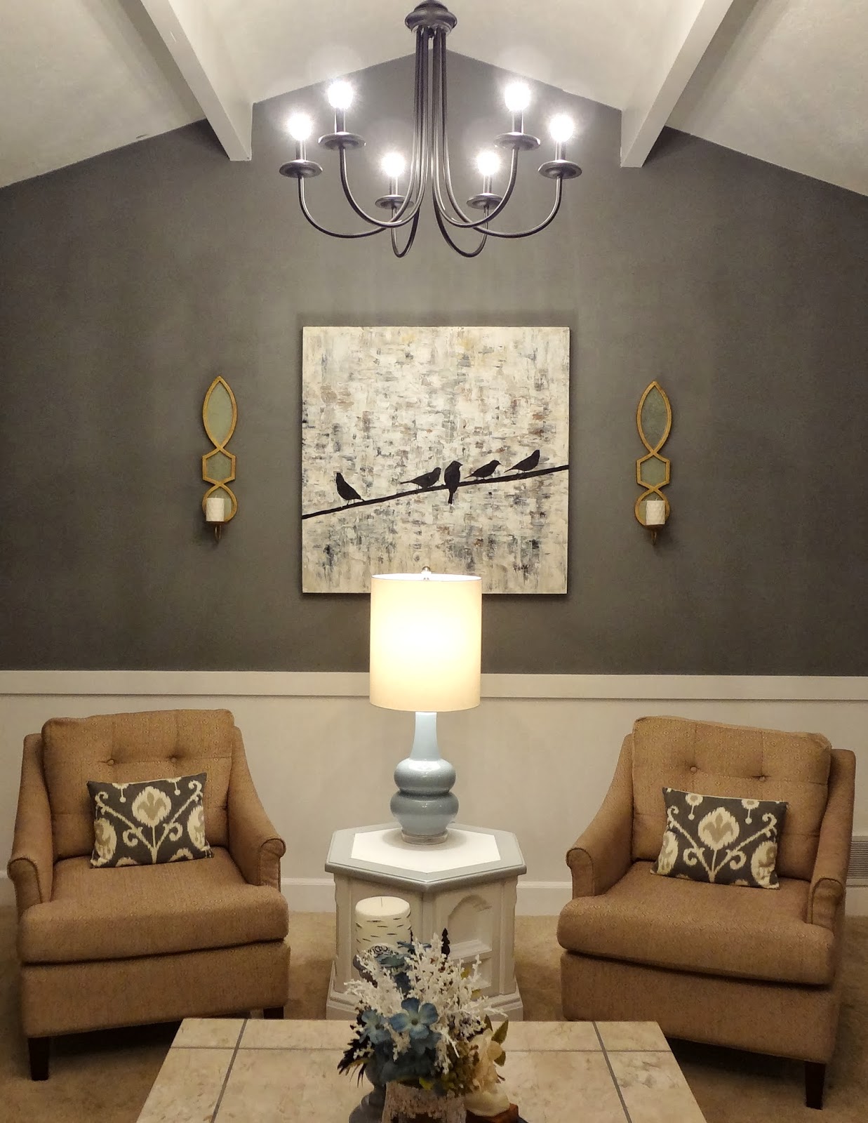
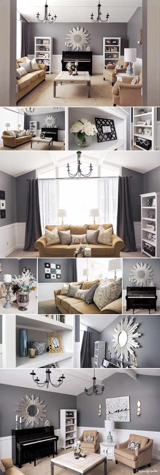
This room is a perfect example of why I LOVE designing as much as I do. I pride myself in budget decorating, this room started with 1970's flesh colored paint, a sofa and a piano. My client just moved in renovated a lot and wanted this room finished so the young family had a retreat while they renovated the rest. They love it and loved the fact that I accomplished this entire room for under $2000! Beautiful design on a dime, my favorite kind!!!
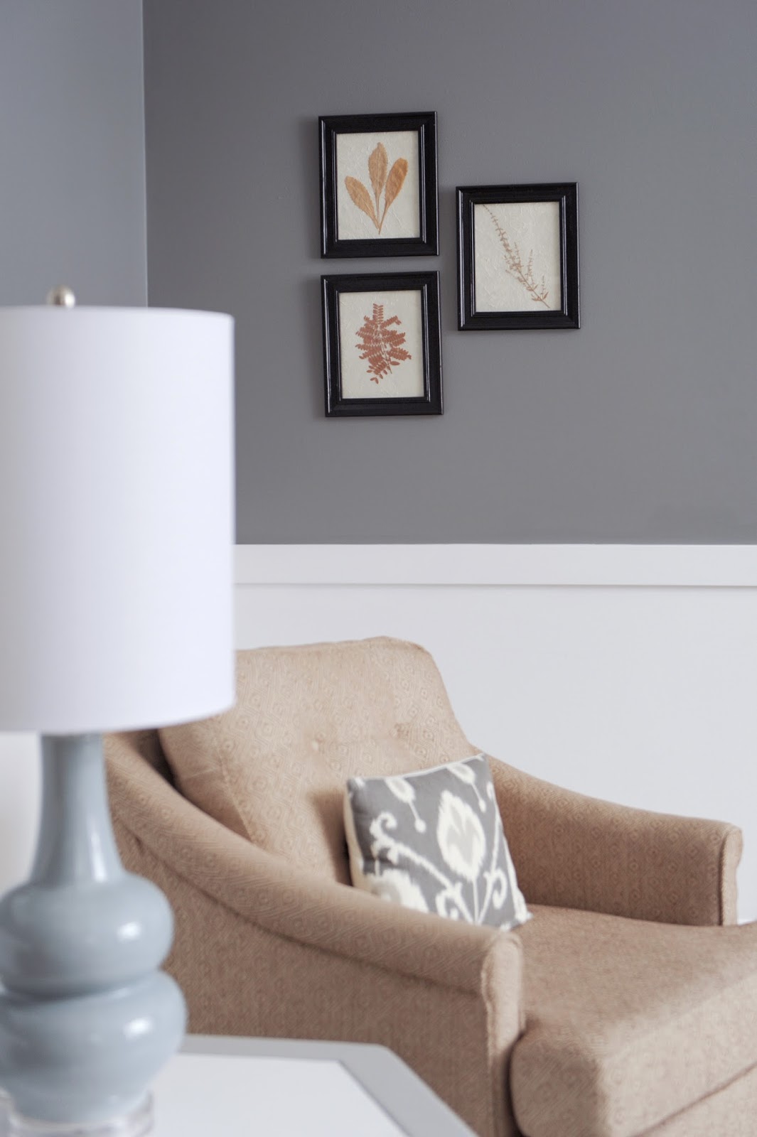
This is my FAVORITE view of the room. I remember my clients eyes when I showed her the paint I wanted her to use. Cityscape by Sherwin Williams. It showed SO dark on the swatch, but I knew with the tall peaked ceiling this room, if any, could handle it and quite frankly, needed the drama. So happy with how the chair rail turned out, and the gorgeous contrast the two colors create.
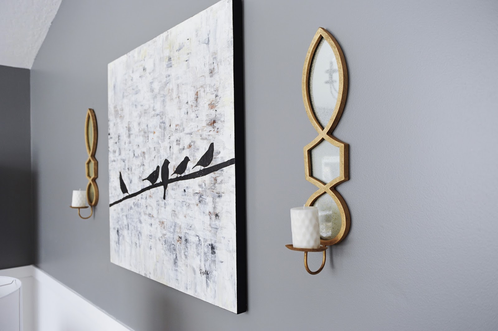
By the way, how cute is this Bird on a wire artwork!? Love how it gives a playful feel to this beautiful room.
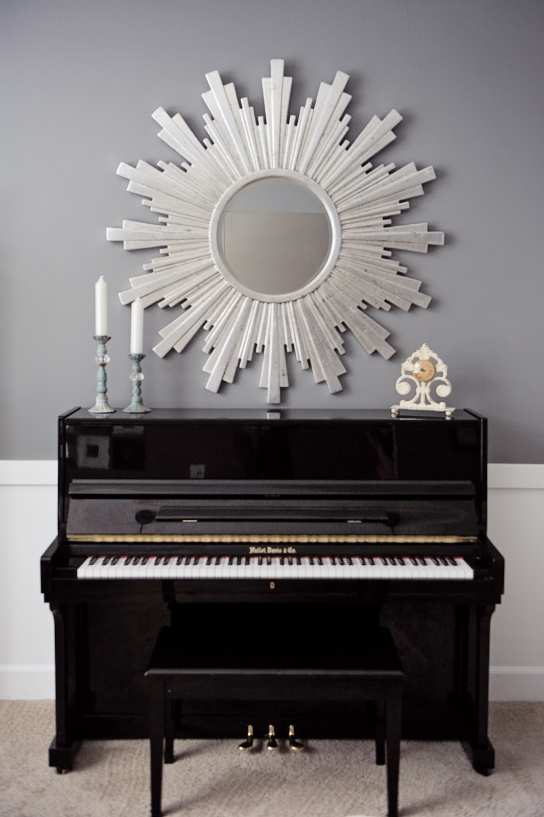
Like I said, we started with this sofa and piano. I bargain hunted like I never had before and couldn't believe the amazing pieces I found! This mirror is a 47" mirror that was on clearance at Zgallerie for $115, that is over $300 off! This marble table (that is heavier than all get out) was $40 on a local classified's site. The bookcases (that we painted the inside a lighter gray) was just over $100 on target.com. The fun chandeliers were $50 at Lowes. So many amazing items at such fabulous prices!!!
I love the drama these curtains create! Both are zgallerie (its hard to tell, but there are sheer ones hanging on the inside of the charcoal ones). I knew we wanted curtains that were dramatic, but at the same time didn't fight the drama of the wall color. So we went one shade darker and had them accentuate the paint color. Love the way it turned out!
These chairs were $69 each at our local overstock outlet. If you are in the Salt Lake area be sure to check them out!!! I have found so many amazing pieces there!
I am telling you, just give it a minute and have a budget, and an item in mind and you should be able to find it. Or better yet, hire me to do it for you! :) I love design, and love the challenge of creating beautiful spaces on a budget.
Labels:
Designed,
Family Room,
Living Room,
Refinished Furniture,
Staging


